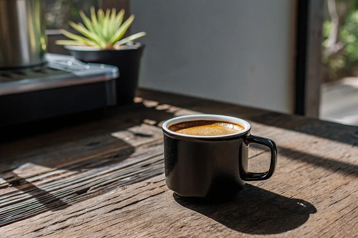
On our production floor, we’ve seen countless cafes struggle with one frustrating problem Delta E color variance 1. Their beautiful custom enamel mugs make great coffee look dull and unappealing.
The interior color of your custom enamel mug directly shapes how customers perceive your coffee’s quality, warmth, and taste. White and neutral interiors create high contrast that makes coffee appear richer and more vibrant. Warm tones like cream or terracotta enhance perceived flavor intensity by up to 28%, while cool blues can dull the visual appeal and reduce perceived taste quality.
This guide will walk you through everything you need to know about selecting the perfect interior color for your wholesale enamel mug orders Pantone matching 2. Let’s explore the science, practical applications, and sourcing strategies together.
How will the interior color of my custom enamel mugs influence my customers' perception of coffee quality?
When we ship samples to café owners across the US and Germany, one question comes up repeatedly quality control procedures 3. They want to know why the same coffee looks different in different mugs.
Interior color creates visual contrast that triggers psychological responses in your customers. White interiors make dark roasts appear bold and premium. Warm interiors like cream or amber boost perceived flavor richness by 20-30%. Cool blue interiors suppress appetite cues and can make coffee seem less flavorful, reducing customer satisfaction significantly.

The Science Behind Color and Coffee Perception
Color psychology 4 plays a massive role in how we experience food and beverages. Our brains process visual information before taste. This means your customers judge their coffee before the first sip.
Research from restaurant studies 5 shows a clear pattern. When one establishment switched from blue plates to warm terracotta, guest satisfaction jumped by 28%. The food was identical. Only the vessel color changed. This principle applies directly to coffee mugs.
Dark coffee against a white interior creates maximum contrast. This makes the brew appear more vivid and premium. The glossy enamel finish amplifies this effect by reflecting light in specific ways.
How Different Interior Colors Affect Perception
| Interior Color | Visual Effect | Perceived Coffee Quality | Best Coffee Type |
|---|---|---|---|
| White | High contrast, bright | Premium, clean, intense | Espresso, dark roasts |
| Cream/Beige | Warm contrast | Rich, comforting | All types |
| Black | Low contrast | Bold, mysterious | Lighter roasts, lattes |
| Blue | Cool suppression | Less flavorful, cold | Not recommended |
| Terracotta | Warm enhancement | Artisanal, rich | Single-origin, pour-over |
The Contrast Principle in Action
High contrast matters most for dark roast coffees. A bright white interior makes espresso look deep and luxurious. The visual "pop" signals quality to your customer's brain.
Low contrast works differently. A black interior mug holding black coffee creates a seamless look. Some specialty roasters prefer this for artistic presentation. But it can mute the coffee's visual appeal for average consumers.
Our quality control team tests every interior color batch. We pour sample coffees to verify the visual presentation meets client expectations. This step prevents costly mistakes in large wholesale orders.
Psychological Triggers That Drive Sales
Warm colors like red, orange, and yellow activate appetite centers in the brain. Studies show these tones increase heart rate and hunger by 10-20%. For coffee, this translates to heightened anticipation and enjoyment.
Cool colors do the opposite. Blue suppresses appetite by 15-25% in controlled tests. Your customers may unconsciously find blue-interior mugs less appealing for hot beverages.
Neutral tones provide balance. They let the coffee itself be the star. This approach works well for premium brands that want sophistication without distraction.
Can I customize the interior enamel shade to better align with my brand's aesthetic requirements?
During development meetings with our design team, brand alignment always comes up. Clients want their mugs to feel like natural extensions of their café identity.
Yes, you can fully customize interior enamel shades to match your brand aesthetics. Most manufacturers offer standard color options plus custom Pantone matching for larger orders. The customization process involves selecting base colors, requesting samples, and approving production batches. Minimum order quantities for custom interior colors typically range from 500-1000 units.

Standard vs. Custom Interior Color Options
Most enamel mug suppliers offer a base palette. This usually includes white, black, cream, and a few accent colors. These standard options ship faster and cost less.
Custom colors require additional steps. You'll need to provide Pantone codes or physical color samples. The factory then creates test batches for approval. This process adds 2-4 weeks to production timelines.
The Custom Color Development Process
| Stage | Duration | Key Activities | Your Involvement |
|---|---|---|---|
| Color Selection | 1-3 days | Choose Pantone codes or samples | Provide reference materials |
| Sample Production | 7-10 days | Factory creates test pieces | Wait for samples |
| Sample Approval | 3-5 days | Review and approve or revise | Inspect and confirm |
| Production | 15-25 days | Full batch manufacturing | Monitor progress |
| Quality Check | 2-3 days | Final inspection | Review QC reports |
Balancing Aesthetics with Functionality
When our engineers develop custom interior colors, they consider more than just appearance. The enamel must resist staining from repeated coffee contact. It must maintain color integrity through thousands of wash cycles.
Dark interior colors hide stains better than light ones. White interiors show every coffee ring and discoloration. Your choice depends on your brand's maintenance capacity and customer expectations.
Glossy finishes amplify color saturation. Matte finishes create a softer, more understated look. Both options affect how coffee reflects light inside the mug.
Brand Alignment Strategies
Your interior color should complement your exterior design. A rustic outdoor brand might choose cream or terracotta interiors. A modern minimalist café might prefer pure white or soft gray.
Consider your logo colors too. If your brand features warm tones, a warm interior creates visual harmony. Conflicting color temperatures can feel disjointed to customers.
We recommend ordering samples in 3-4 interior color options. Test them with your actual coffee products. Photograph them in your café lighting. This real-world testing reveals the best choice before you commit to wholesale quantities.
What are the best interior color options to ensure my coffee presentation stays clean and stain-free?
In our factory testing lab, we subject enamel samples to harsh conditions. We want to know which interior colors hide wear and maintain beauty over time.
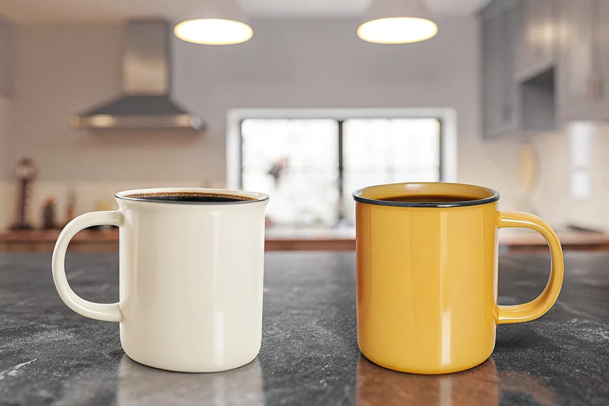
For stain resistance and clean presentation, cream, beige, and warm off-white interiors perform best. Pure white shows stains quickly but offers superior visual contrast. Black interiors hide coffee residue completely but sacrifice contrast. A middle-ground approach using warm neutrals balances aesthetics with practical maintenance needs for busy cafés.
Understanding Coffee Staining Patterns
Coffee contains tannins and oils 6 that cling to surfaces. Over time, these compounds create visible discoloration. The staining process accelerates with heat and repeated exposure.
Lighter interior colors show this staining more prominently. A pristine white interior can develop yellow-brown tinting within weeks of heavy use. This affects your brand's premium image.
Darker interiors mask staining naturally. Black and deep brown hide coffee residue almost completely. But you lose the visual contrast that makes coffee look appealing.
Interior Color Stain Visibility Comparison
| Interior Color | Stain Visibility | Cleaning Frequency | Visual Coffee Contrast | Overall Maintenance |
|---|---|---|---|---|
| Pure White | Very High | Daily | Excellent | High effort |
| Cream/Off-White | Moderate | Every 2-3 days | Very Good | Medium effort |
| Light Gray | Low-Moderate | Weekly | Good | Low effort |
| Beige/Tan | Low | Weekly | Good | Low effort |
| Black | None | As needed | Poor | Minimal effort |
| Terracotta | Very Low | Weekly | Good | Low effort |
Practical Maintenance Considerations
For high-volume cafés, maintenance efficiency matters. Staff time spent scrubbing stains adds up. Your interior color choice directly impacts operational costs.
We often recommend cream or warm off-white for commercial clients. These shades hide minor staining while maintaining good coffee contrast. The warm undertones also enhance perceived coffee quality.
If your brand demands pure white interiors, plan for intensive cleaning protocols. Baking soda paste removes most coffee stains. But prevention through frequent washing works better than removal.
Special Coatings and Treatments
Some manufacturers offer anti-stain treatments. These clear coatings create a barrier between coffee and enamel. They extend the pristine appearance of light-colored interiors.
Our production line can apply these treatments upon request. The cost increases slightly, but many café owners find the investment worthwhile. It reduces long-term maintenance labor and keeps mugs looking new longer.
Ask your supplier about available protective treatments. Request durability data showing how long the protection lasts under normal use conditions.
How do I confirm that my supplier can achieve consistent interior color matching for my wholesale order?
When we finalize contracts with new wholesale clients, color consistency concerns come up immediately. Café owners cannot accept mugs that look different from batch to batch.
To confirm consistent interior color matching, request production samples before approving large orders. Ask for Delta E color variance specifications, which should be under 2.0 for professional results. Require written quality control procedures and inspection reports. Conduct video calls during production to verify color matching against approved samples in real time.
The Color Matching Challenge in Enamel Production
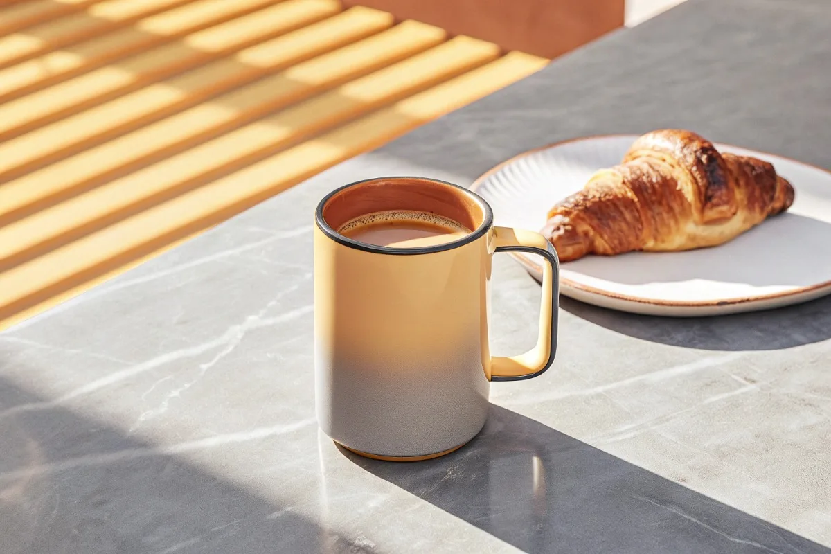
Enamel color consistency requires precise control. Pigment ratios, firing temperatures, and timing all affect final results. Small variations create noticeable color differences.
Professional manufacturers use spectrophotometers 7 to measure color accuracy. These devices quantify color using Delta E values. Lower numbers mean closer matches to the target color.
Quality Control Checkpoints for Color Consistency
| QC Stage | What to Request | Acceptable Standards | Red Flags |
|---|---|---|---|
| Pre-Production | Color sample approval | Exact Pantone match | Vague color descriptions |
| First Article | Initial production sample | Delta E < 2.0 | No measurement data |
| In-Process | Random batch testing | < 5% variance | Skipped inspections |
| Final Inspection | Full batch verification | 100% visual check | Partial sampling only |
| Documentation | Color reports per batch | Written records | Verbal assurances only |
Building a Reliable Quality Assurance Process
Start by establishing clear color standards. Provide physical samples or precise Pantone codes. Never rely on digital images alone. Screen colors vary between devices.
Request a pre-production sample meeting your exact specifications. Inspect it under multiple lighting conditions. Natural daylight reveals color accuracy best.
Our team photographs every approved sample with standardized lighting. These reference images become part of your production file. Workers compare ongoing production against these standards.
Communication Protocols That Prevent Problems
Regular updates during production prevent color drift. Ask for progress photos at set intervals. Schedule video calls to view actual mugs being produced.
Define escalation procedures before problems occur. Know who to contact if color issues arise. Fast response times prevent large quantities of off-spec mugs.
Document everything in writing. Email confirmations create records. These protect both parties if disputes arise about color accuracy.
Handling Color Variations When They Occur
Despite best efforts, variations sometimes happen. Establish acceptable tolerance ranges upfront. Minor variations below perceptible thresholds may be acceptable.
Define consequences for unacceptable variations. Will the factory remake the batch? Who covers shipping costs for replacements? These terms belong in your purchase agreement.
Long-term supplier relationships build consistency. Factories learn your standards over time. First orders may need more supervision than repeat orders.
Conclusion
Interior color selection shapes how customers experience your coffee visually and emotionally. Choose wisely based on brand aesthetics, maintenance needs, and supplier capabilities.
Footnotes
1. Explains Delta E as a standard for quantifying color differences and ensuring accuracy. ↩︎
2. Provides a comprehensive overview of the Pantone Matching System and its standardization. ↩︎
3. Highlights the importance of quality control procedures in manufacturing for product consistency. ↩︎
4. Replaced with an authoritative Wikipedia article on color psychology, which includes its influence on food perception. ↩︎
5. Discusses how plate color in restaurant settings influences food perception and consumption. ↩︎
6. Explains how tannins and oils in coffee contribute to staining surfaces. ↩︎
7. Replaced with an authoritative Wikipedia article providing a comprehensive overview of spectrophotometry. ↩︎