
When our production team receives a cafe order with vague color descriptions, the results often disappoint Pantone Solid Coated codes 1. A “forest green” to one brand means something completely different to another. This mismatch creates frustration, wastes time, and damages brand identity.
Cafes can communicate color consistency by providing Pantone Solid Coated codes, requesting physical pre-production samples, establishing master samples for future batches, and specifying finish preferences. Clear documentation, regular supplier communication, and quality control checkpoints throughout production ensure your brand colors remain accurate across every order.
Let me walk you through the exact steps we recommend to our cafe clients physical pre-production samples 2. These strategies come from years of handling custom enamel mug orders for brands across the United States, Germany, and Australia.
How do I provide the correct Pantone codes to ensure my cafe's brand colors are perfectly matched?
Many cafe owners send us JPEG logos and expect perfect color reproduction quality control steps 3. The problem is digital files look different on every screen. Without standardized references, your brand red might arrive as orange.
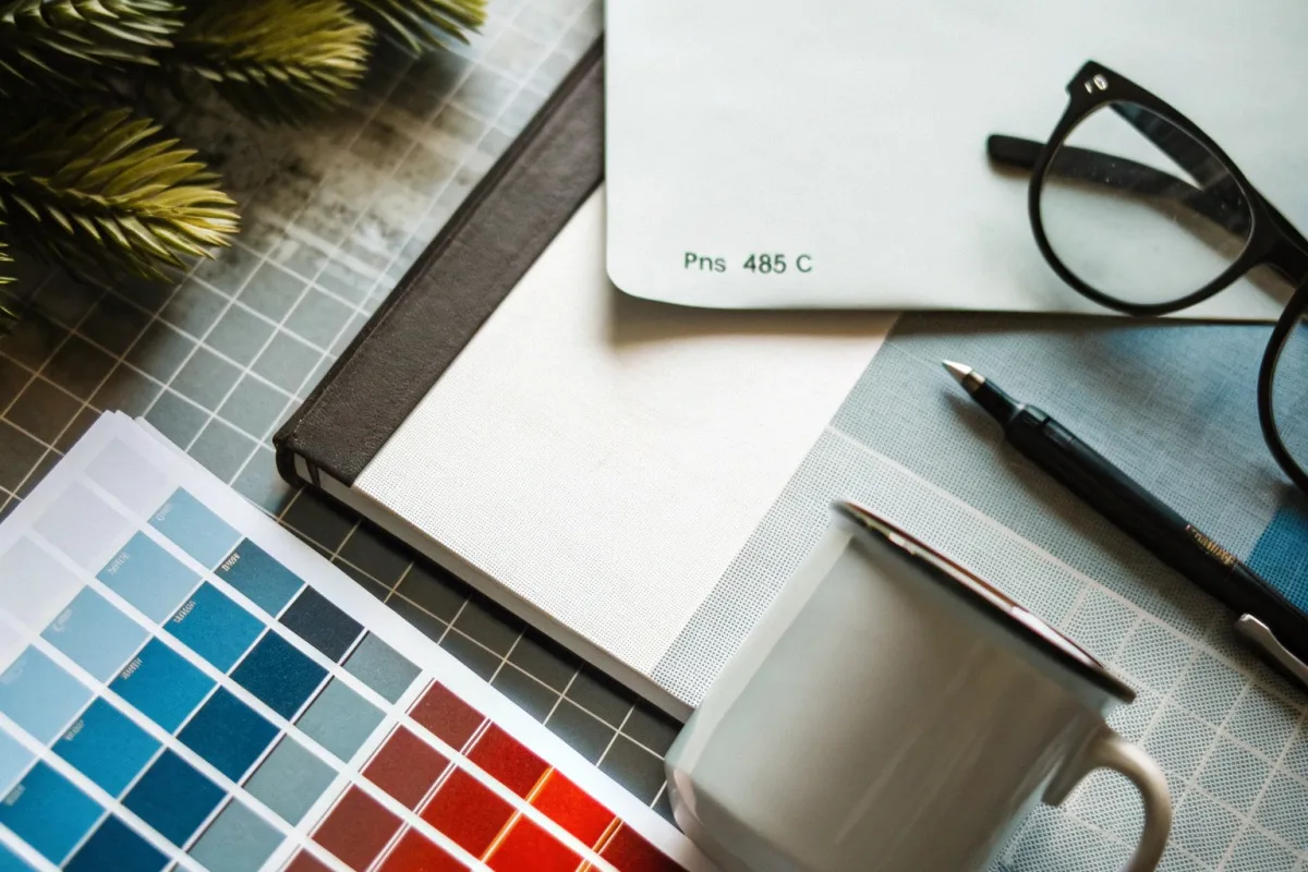
Provide Pantone Solid Coated (PMS) codes for every brand color you need matched. Include a physical color swatch when possible, specify the exact Pantone number (like PMS 485 C for Coca-Cola red), and note whether your brand guidelines allow any tolerance range. This universal language removes guesswork from the manufacturing process.
Why Pantone Matters for Enamel Production
Our facility works with thousands of Pantone colors. The Pantone Matching System 4 gives us a physical reference that doesn't change based on monitor settings or lighting. When you say "PMS 7463 C," our colorists know exactly what shade of teal you need.
Enamel production 5 involves high-heat firing. This process can shift colors slightly compared to what you see on screen. Pantone codes account for this because we have historical data on how each shade behaves after firing.
Steps to Find and Communicate Your Pantone Codes
First, check your existing brand guidelines. Most professional logos were designed with Pantone specifications. If you don't have them, ask your graphic designer or use Pantone's color finder tool.
Second, specify whether you need "Coated" or "Uncoated" versions. For glossy enamel mugs, Pantone Solid Coated works best. The "C" suffix indicates coated paper, which mimics how colors appear on shiny surfaces.
Third, send us both digital files AND written Pantone codes. This redundancy prevents errors.
Common Pantone Communication Mistakes
| Mistake | Why It Causes Problems | Correct Approach |
|---|---|---|
| Sending only RGB values | RGB varies by device | Convert to Pantone using Adobe or Pantone tools |
| Using outdated Pantone books | Colors fade over time | Reference editions less than 2 years old |
| Assuming "close enough" works | Brand inconsistency compounds | Request exact matches or approved alternates |
| Forgetting secondary colors | Accent colors get neglected | Document every color in your brand system |
| Not specifying rim/interior colors | Unmatched elements look amateur | Include Pantone codes for all visible surfaces |
RGB to Pantone Conversion Tips
Your designer probably created your logo in RGB format. Our pre-production team can convert this, but results improve when you control the process. Adobe Illustrator and Photoshop have built-in Pantone libraries. Select your color, then use the "Convert to Pantone" function.
Keep in mind that not every RGB color has a perfect Pantone match. Some vibrant neons dull significantly in Pantone conversion. If your brand uses electric colors, discuss alternatives with us early. We can show you fired samples of similar shades before you commit.
Can I request a physical pre-production sample to verify color accuracy before my bulk order starts?
Looking at digital proofs on a computer screen gives incomplete information. What appears perfect in your inbox might shock you when the actual mug arrives. Pre-production samples solve this uncertainty.
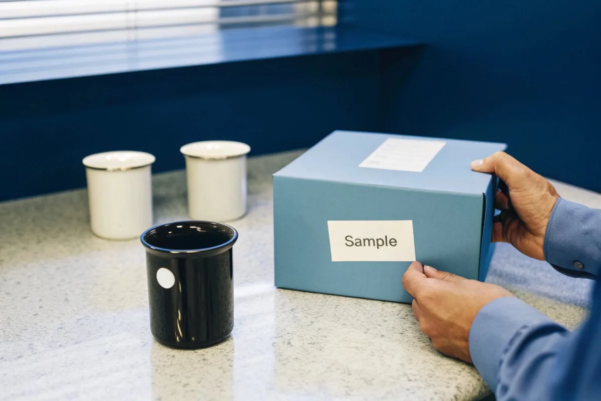
Yes, you should always request physical pre-production samples before approving bulk production. These samples let you evaluate actual color accuracy, finish quality, and print durability under real-world conditions. Most reputable manufacturers offer sample runs of 1-5 pieces, typically at a premium cost, which saves significant money compared to rejecting entire batches later.
What Pre-Production Samples Reveal
When we fire test samples through our kilns, you see how your specific design interacts with the enamel coating process. Heat affects different colors differently. Blues tend to remain stable. Some reds shift toward orange. Yellows can darken.
Samples also reveal how your logo appears on curved surfaces. Flat digital proofs don't show stretching, seam placement, or handle obstruction. Physical samples expose these issues before they become expensive problems.
Our Sample Process Timeline
We recommend building 10-14 days into your schedule for sampling. Here's how the process works at our facility:
| Stage | Duration | What Happens |
|---|---|---|
| Design confirmation | 1-2 days | We finalize artwork and Pantone matches |
| Sample production | 3-5 days | Small batch goes through full production |
| Quality inspection | 1 day | Our QC team checks against specifications |
| Shipping to client | 5-7 days | Express delivery to US/Europe/Australia |
| Client review | 2-3 days | You evaluate and provide feedback |
What to Check When Samples Arrive
Examine your samples under multiple lighting conditions. Cafe environments vary. Check colors under natural daylight, warm incandescent bulbs, and cool fluorescent lights. Colors shift dramatically between these sources.
Test the print durability. Hand-wash the sample several times. Does the design scratch easily? High-temperature decal printing resists fading better than cheaper alternatives. Our process uses kiln-fired decals that become part of the enamel surface.
Compare the sample against your Pantone swatch or previous approved products. Hold them side by side. Note any variations. Minor differences are normal in enamel production, but significant shifts require correction before bulk production begins.
Sample Cost Considerations
Sample charges vary by complexity. Simple single-color designs cost less than full-wrap photographic prints. Consider samples an investment in order protection. One rejected bulk shipment costs far more than proper sampling.
We credit sample costs toward bulk orders above certain minimums. Ask about this policy when you place your sample request. Most professional suppliers offer similar arrangements because we want your business long-term.
What quality control steps should I require to prevent color variations between different production batches?
Your first order arrives perfectly matched. Six months later, you reorder and the colors look different. This inconsistency confuses customers and weakens brand recognition. Preventing batch variations requires systematic quality control.
Require these quality control steps: establish a master sample from your first approved batch, mandate colorimeter measurements against Pantone standards, request batch-by-batch inspection photos, and include color tolerance specifications in your purchase agreement. Systematic QC documentation creates accountability and enables quick correction when variations occur.
Why Batch Variations Happen
Enamel production involves organic processes. Kiln temperatures fluctuate slightly between firings. Different batches of enamel powder may have microscopic composition differences. Human factors in manual inspection add variability.
Understanding these causes helps you set realistic expectations. Zero variation is impossible. The goal is keeping variations within acceptable tolerances that customers won't notice.
Master Sample System
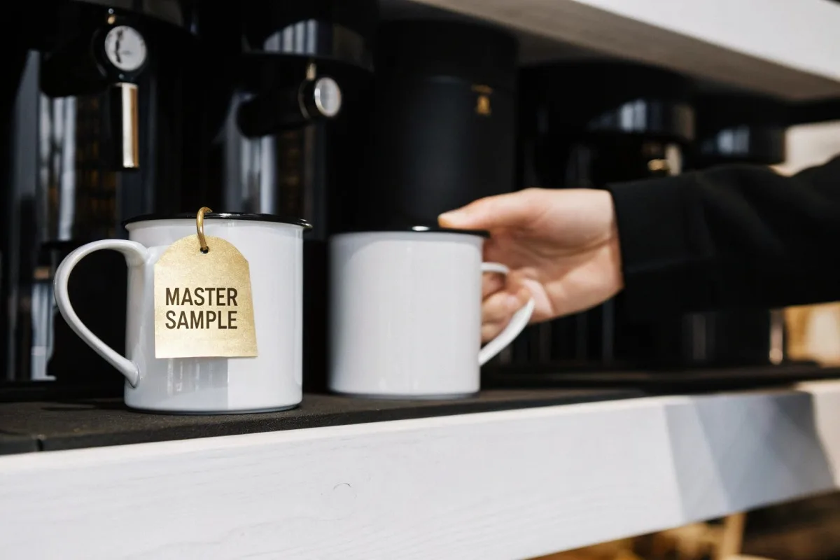
After approving your first batch, designate one piece as your "master sample." We keep one here, and you keep one at your location. Every future batch gets compared against these physical references.
Master samples degrade over time from handling and light exposure. Replace them every 12-18 months or after every 3-4 reorders. Document when you establish new masters.
QC Checkpoints We Recommend
| Checkpoint | Timing | Measurement Method | Acceptable Tolerance |
|---|---|---|---|
| Pre-production color mix | Before firing | Visual comparison to Pantone | Delta E < 1.0 |
| Post-firing sample | First 10 pieces | Colorimeter reading | Delta E < 2.0 |
| Mid-batch inspection | Every 200 pieces | Visual against master sample | No visible deviation |
| Final batch check | Before packing | Random 5% sample review | 98% pass rate |
| Pre-shipment verification | After boxing | Photo documentation | Client approval |
Understanding Delta E Measurements
Delta E measures the mathematical difference between two colors. A Delta E of 1.0 or less is imperceptible to most people. Delta E measurements 6 Values between 1-2 are noticeable only by trained observers side-by-side. Above 2.0, average customers may notice differences.
We use spectrophotometers 7 to measure Delta E values objectively. This removes subjective disagreements about whether colors match. Include maximum Delta E specifications in your supplier agreement for clear accountability.
Documentation Requirements
Request these documents with every batch:
Production inspection reports with photos of finished pieces. Colorimeter readings from beginning, middle, and end of production runs. Any deviation notes explaining why adjustments were made. Certificate of conformance stating the batch meets agreed specifications.
This documentation creates paper trails. If problems arise, you can identify exactly when and why variations occurred. Good suppliers welcome this accountability because it builds trust.
How do I communicate my specific aesthetic expectations to ensure the enamel finish matches my cafe's branding?
Color accuracy matters. But finish quality matters equally. A perfect Pantone match on the wrong finish ruins your brand aesthetic. Glossy versus matte changes how customers perceive your entire cafe identity.
Communicate aesthetic expectations by specifying gloss level (high-gloss, satin, or matte), providing reference images from competitors or inspiration sources, describing your cafe's overall design philosophy, and requesting finish samples alongside color samples. Include finish specifications in your written brief to prevent assumptions that lead to mismatched results.
Gloss Levels and Their Effects
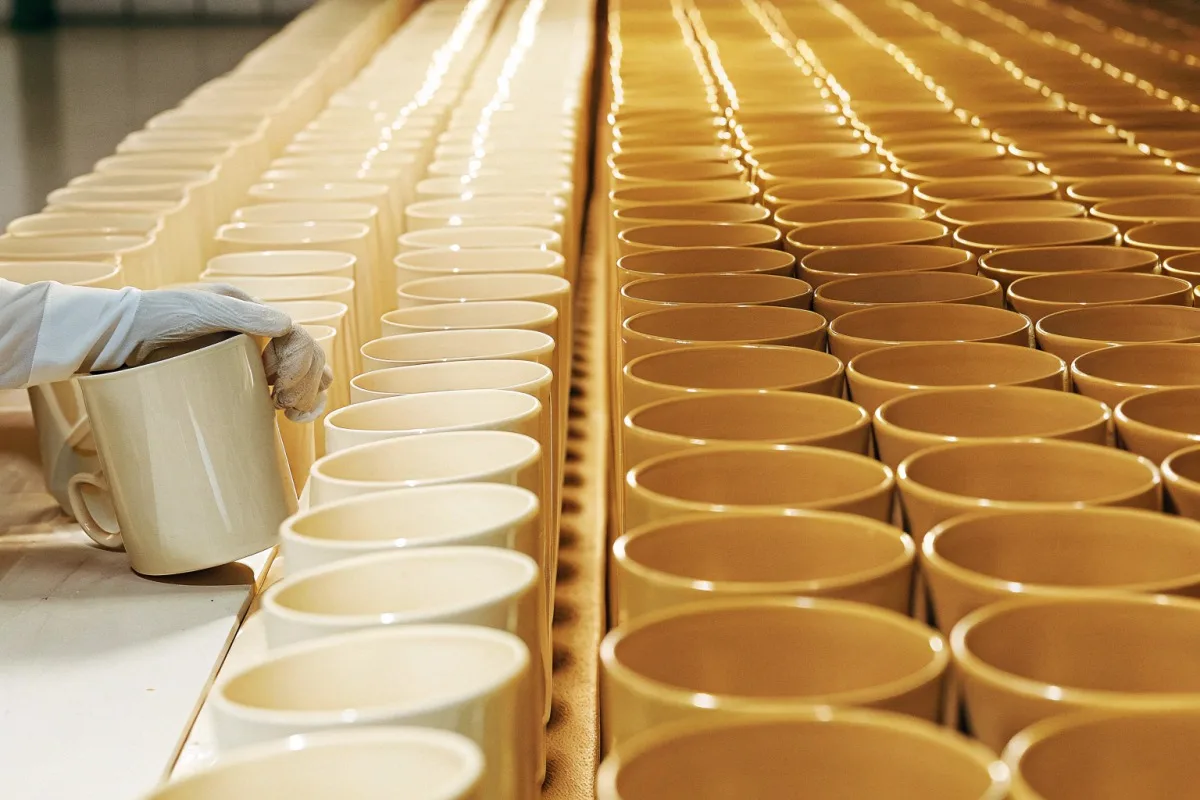
Finish dramatically affects color perception. The same Pantone blue appears more saturated on high-gloss surfaces. On matte finishes, it looks softer and more muted. Neither is wrong—they serve different brand personalities.
Our facility offers three primary finish levels:
| Finish Type | Gloss Units (GU) | Best For | Color Effect |
|---|---|---|---|
| High-gloss | 80+ GU | Vibrant brands, easy cleaning | Maximum color saturation |
| Satin/semi-gloss | 40-60 GU | Balanced look, fingerprint hiding | Moderate saturation |
| Matte | Below 20 GU | Artisanal, rustic aesthetics | Softer, muted tones |
Creating an Effective Design Brief
Your design brief should include more than just logo files and Pantone codes. Describe your cafe's personality. Are you modern and minimalist? Rustic and cozy? Industrial and urban? These descriptions help us understand intent behind your specifications.
Include photos of your cafe interior. Show us your furniture, walls, and existing merchandise. This context reveals whether glossy mugs will complement your space or clash with it.
Handling the Mug Base Color Question
The base enamel color affects everything printed on top. White bases produce the most accurate colors because they don't compete with your design. Cream bases add warmth but shift cool colors slightly yellow. Black bases require special treatment for anything other than light-colored designs.
If your brand uses dark colors extensively, consider interior finish separately. A black exterior with a contrasting white or colored interior creates visual interest while maintaining functionality. Coffee looks more appetizing against lighter interiors.
Rim and Handle Specifications
Many cafe owners forget about secondary elements. Stainless steel rims add premium perception and durability. Colored rims can complement or contrast your main design. Handles can match the body or accent it differently.
Document every visible surface in your specifications. A mug has at least five specification zones: exterior body, interior, rim, handle, and bottom. Incomplete briefs lead to supplier assumptions that may not match your vision.
Design Best Practices for Consistent Results
High-contrast designs reproduce more reliably than subtle gradients. Bold lines survive the firing process better than fine details. If your logo contains thin elements, discuss minimum line weights with our design team before production.
Avoid placing critical brand elements near seams, handles, or extreme curves. These areas experience more stretching during production. Center important elements on flat portions of the mug body for best results.
Conclusion
Color consistency for cafe enamel mugs requires Pantone codes, physical samples, systematic QC, and clear aesthetic briefs. Partner with manufacturers who welcome these requirements as standard practice.
Footnotes
1. Official Pantone site explaining their color systems, including Solid Coated. ↩︎
2. Defines pre-production samples and their importance in manufacturing. ↩︎
3. Provides an essential guide to quality control processes and best practices in manufacturing. ↩︎
4. Official Pantone source detailing the Pantone Matching System. ↩︎
5. Explains the process of vitreous enameling, relevant to enamel mug production. ↩︎
6. Explains what Delta E measures and its importance for color accuracy. ↩︎
7. Describes spectrophotometers as color measurement devices and their function. ↩︎